Three volunteers had just finished a litter pickup on Chicago's South Side when hail drove them under a trail shelter. Their cardboard sign dissolved in the rain, but that night, from memory, we drew the first Litter Caterpillars logo.
The Day Three Volunteers Got Caught in a Chicago Hail Storm
The spring afternoon had started smoothly. Three of us walked back toward the trail shelter after picking up trash, carrying full bags, wet gloves, and the loose confidence that comes from thinking the weather will hold for one more block.
Then the sky changed. Hail hit the path hard enough to sting our faces. The cardboard sign reading “volunteers needed” sagged in our hands, and every ride we tried to call canceled while we stood there shivering. We crowded beneath the shelter, watching the field we had just cleaned disappear behind a sheet of gray weather.
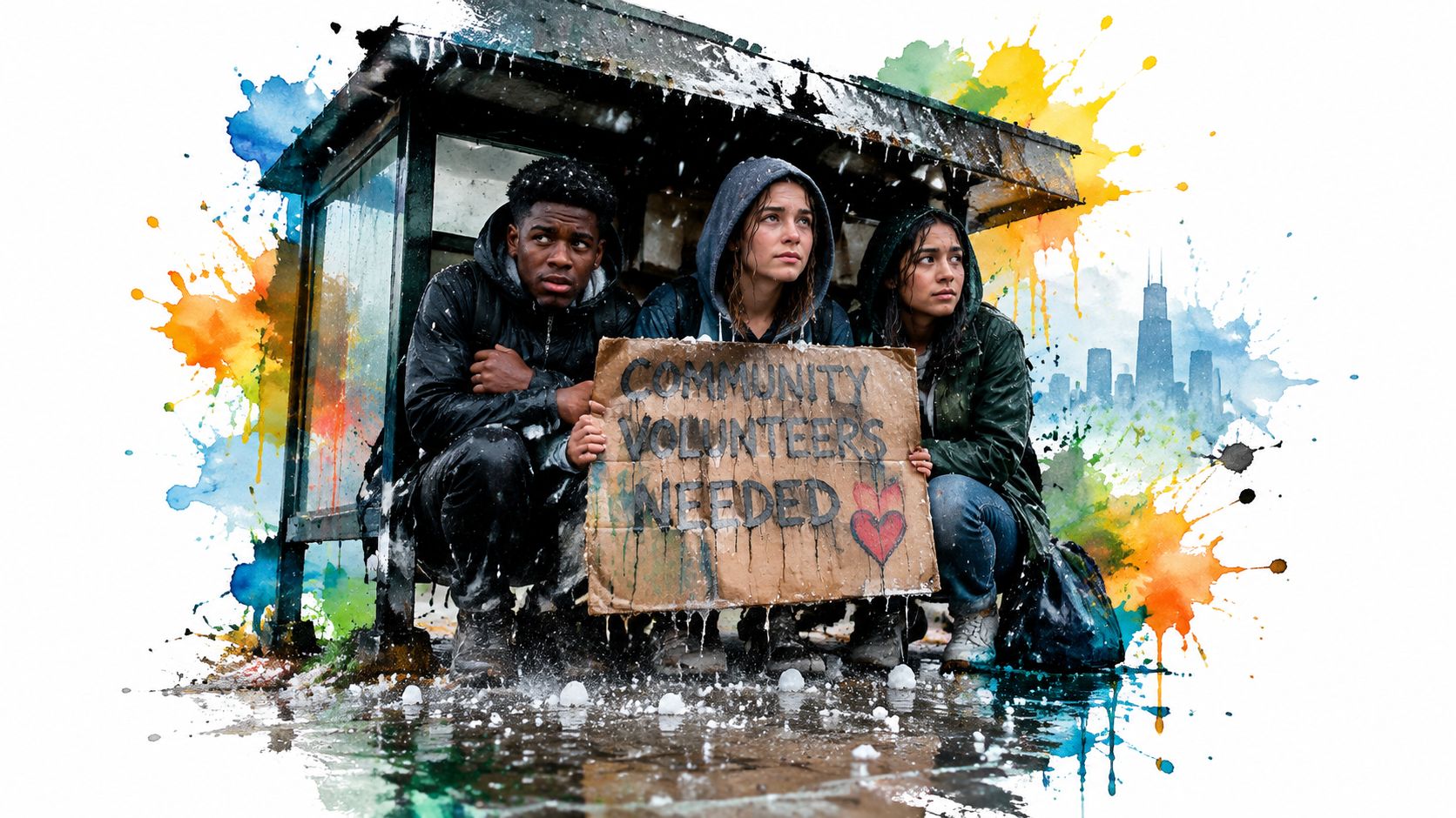
That storm became our first identity lesson. We didn't create a logo after a long meeting about market position. We drew it later because we needed a way to remember what had happened. The mark carried the three people, the soaked sign, the cold, and the strange laughter that arrived after we realized we'd have to wait it out together.
A mark born from the work
Our name, Litter Caterpillars, already held a story. A caterpillar moves slowly, keeps going, and changes along the way. We weren't presenting ourselves as perfect organizers. We were people trying to practice cleanliness, consistency, bravery, and friendship through service.
The first sketch captured that feeling. It gave us something to put on a sign, then a shirt, then a flag. Each use told a small part of the same story to someone who hadn't been under that shelter with us.
A logo can carry memory in a compact form. One recent compilation reports that 75% of people say they recognize a brand by its logo, and consumers typically need 5 to 7 exposures before they remember a brand, according to logo recognition and memory data. Those figures describe brands broadly, yet the practical lesson works for a volunteer crew too. People need repeated chances to connect your mark with your people and your work.
Our practical rule: Draw the thing your group has already lived. A polished mark with no story feels rented. A rough mark tied to a real memory can give people somewhere to belong.
The rest of this guide follows that approach. Use what you have, keep the system easy to repeat, and let the identity grow from the mornings when people show up.
What Logo and Identity Actually Mean for a Small Group
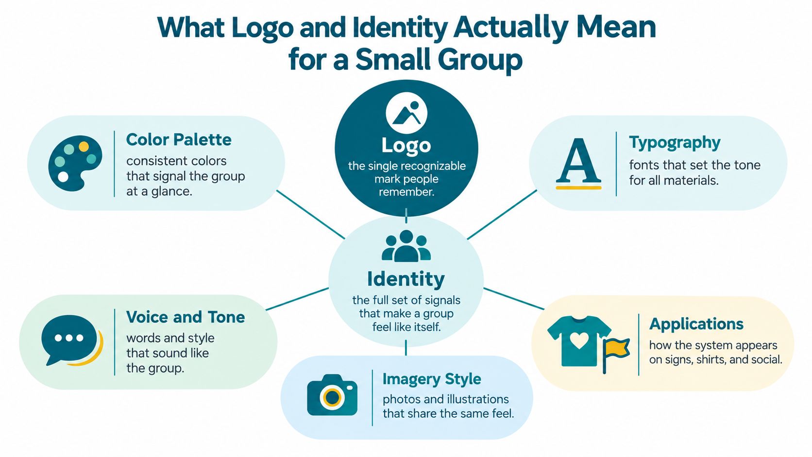
A logo is the single mark people can recognize and remember. It might be a caterpillar, a hand, a tree, a neighborhood outline, or a wordmark built from your group's name.
Identity is larger. It includes every repeated signal that makes the group feel like itself: colors, type, badges, flags, phrases, photographs, meeting rituals, and sound. When those pieces work together, a volunteer can spot your table across a park before reading the sign.
Think in signals, not files
The Caterpillar Park badge makes the difference easy to see. The badge has the mark, the group color, the park name, and the feeling of having helped turn an empty lot in Englewood into a place people could use. The badge isn't only a graphic file. It becomes a patch on a jacket, a small sign at an event, and a reminder that volunteers helped make the place.
You can map your own system with a short list:
- Logo: The mark people identify first.
- Color: A repeatable visual cue for signs, shirts, and posts.
- Typography: Letterforms people can read on a windy banner or a small phone screen.
- Badge: A compact symbol for membership, service, or achievement.
- Flag: A large signal that helps people locate your group from a distance.
- Voice: The words and tone people hear in invitations and announcements.
- Sound: A short theme or sonic signature that can bring the group to mind.
Flags and badges already carry group meaning outside volunteer work. The Governor General of Canada's heraldry guide explains that flags can identify a country, school, sports team, province, or cause, while badges can show belonging to a group or belief in a cause. That matches what happens at a cleanup. A flag tells a newcomer where to walk. A badge tells a returning volunteer, “You're part of this.”
For a deeper look at making a mark that remains useful over time, how to design a lasting logo gives practical design guidance. Keep your own standard simple: if a volunteer can't redraw the idea, explain it, or use it without special software, the system needs less complexity.
The Pieces Inside a Real Identity System
At a highway bike-event shutdown, our flying caterpillar flag did a job that a small logo couldn't do alone. Volunteers needed to know where the crew gathered, drivers needed to see the closed work area, and passersby needed a quick answer to the question, “Who is doing this?”
One color can become a shortcut
Our green started by accident. We used the green material we had, then repeated it because buying another color made no sense. Soon, green meant Caterpillars before anyone read the name.
Color helps, but shape carries the mark when printing gets messy or a screen turns small. A 2026 cross-market analysis reported that shape-based assets reached 40% Fame and 71% Uniqueness, while color assets reached 12% Fame and 39% Uniqueness, as described in the analysis of shape and color brand assets. I take that as a useful budget rule. Protect the silhouette first, then choose colors that help people find it.
Research on logo familiarity also shows that people remember color more strongly when they already know a brand, while low- and mid-familiarity conditions don't show the same memory-color effect, according to research on color and shape in logo memory. New groups should keep both the shape and the color consistent while people learn them.
Type needs to survive the park
We picked friendly, readable lettering because a banner can flap, fold, and sit several steps away from the person reading it. A decorative font might look lively on a laptop and become mud on a windy fence.
Badges handle close viewing. Flags handle distance. A wordmark handles names and announcements. Supporting graphics, like a repeating caterpillar pattern or a simple leaf icon, fill empty space without forcing the main logo into every corner.
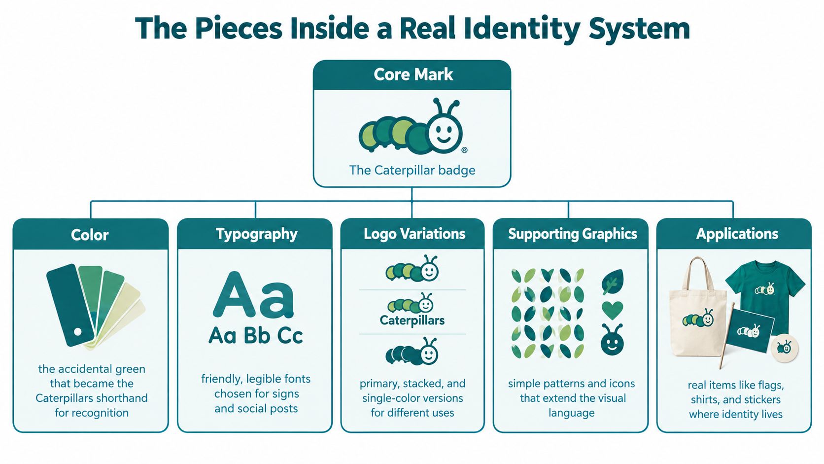
At the bike event, those pieces worked as a set. The flag helped people find us. The badge identified volunteers up close. The banner explained the temporary boundary. The same green and caterpillar shape made the separate objects feel connected.
Budget test: Print the mark in one color, shrink it to a profile picture, and view it from across a room. If people lose the shape or the name, simplify before you buy more gear.
Sound can join the system too. A sonic logo is a short sequence of notes, effects, or vocalizations that helps bring a brand to mind when people hear it, according to this review of sound branding and sonic logos. Our theme song gives event videos and group moments another way to feel connected.
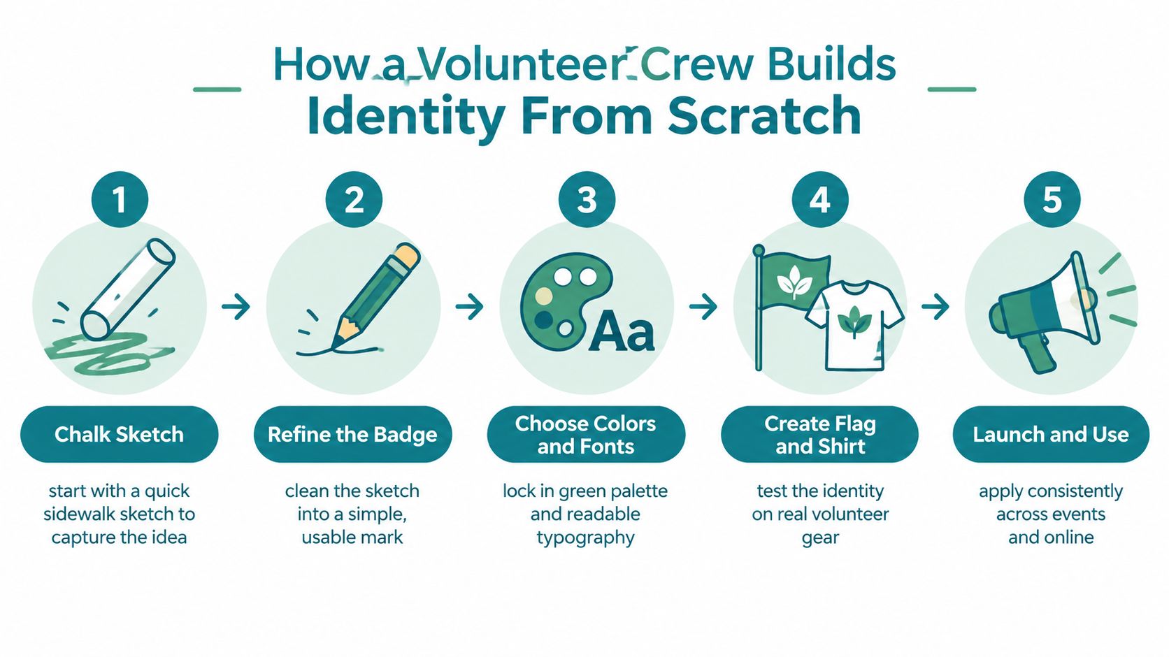
How a Volunteer Crew Builds Identity From Scratch
You don't need an agency presentation to begin. You need a Saturday morning, a notebook, a few examples, and people willing to make decisions instead of leaving every choice open forever.
Start with the story
Gather examples that feel close to your group. Look at a park sign, a sports patch, a neighborhood flag, or an old volunteer shirt. Each person should bring one example and explain what they like about it. Don't copy the artwork. Notice the qualities: bold, welcoming, practical, playful, serious.
Then sketch together. The Litter Caterpillars idea began as a chalk drawing on a sidewalk before it became a working badge, flag, and logo lockup. Draw quickly in a shared notebook. Try animals, tools, hands, streets, plants, and letter shapes. Keep the first round loose.
Build the smallest usable set
Use this sequence:
- Clean the badge: Choose one sketch and remove details that disappear when the mark gets small.
- Choose two colors: Pick colors that still print clearly through the cheapest printer setting. Keep green if it carries your group's story, but test it on white, dark fabric, and plain paper.
- Choose one wordmark: Use readable type for the full group name. Save decorative lettering for optional event art.
- Make a flag: Create a large version that people can spot at a rally, cleanup, or shared public space.
- Test a shirt: Put the badge on a sleeve or chest, then ask volunteers whether they can read it while moving.
- Write one page of rules: Show the primary logo, the small logo, the colors, the type choice, clear space around the mark, and examples of what not to do.
- Use a shared folder: Store editable files, print files, transparent images, and the one-page guide where the whole crew can find them.
Your group can build the visuals alongside its habits. The Litter Caterpillars approach to organizational culture building connects identity with the repeated choices volunteers make together. Keep the process friendly. A system that only one person understands will fail when that person misses a cleanup.
Where Identity Shows Up in the Real World
At Caterpillar Park, the flag hangs from the picnic shelter before volunteers arrive. Someone walking along the path can see the color moving in the wind and find the gathering point without checking a message thread.
That same person sees the badge later on a hi-vis vest. At close range, the patch answers a different question. The flag says, “We're over here.” The badge says, “This person belongs to the crew.” A mark on a shirt can also open a conversation. People ask what the group does, and a volunteer can invite them to the next pickup.
Objects give the system a place to live
At the highway bike-event shutdown, a banner stretched across the closed lane made the temporary space readable. The logo didn't replace the safety instructions, cones, or event signs. It gave the work a visible owner and helped pedestrians connect the people managing the space with the group they had seen online.
Volunteers also use smaller surfaces:
- Shirts and vests: Put the badge where people can see it while working.
- Totes and stickers: Use the single-color mark when printing space or budget is tight.
- Event flyers: Keep the group name readable before adding extra artwork.
- Meetup thumbnails: Use the silhouette so it survives a small crop.
- Instagram posts: Repeat the same color treatment without forcing every photo into an identical template.
If you need practical help preparing crisp custom apparel logos from Raccoon Transfers, focus first on the file format, size, placement, and fabric color your volunteers will use. A beautiful mark can still fail if the smallest text disappears into a vest seam.
Digital identity needs the same field test as physical identity. Shrink your logo until it fits a profile image. Remove extra wording if the name becomes unreadable. Then check whether a new volunteer can identify the account among several event listings.
The Litter Caterpillars guide to social media for volunteer recruitment treats posts as invitations to participate, not as a gallery of perfect designs. Show the gloves, bags, weather, jokes, and finished blocks. Your identity should help those moments feel connected.
A group symbol can also change how people see the group around it. Research on logos, flags, and similar emblems found that shared symbols can make a collection of people seem more unified, effective, and coordinated, even when members don't look alike on their own, according to this summary of group-symbol research. That effect doesn't require expensive merchandise. It begins when people wear, carry, and repeat the same small signals while doing work together.
Why Identity Is More Than Decoration
A logo can look decorative when it sits alone on a file. It behaves differently when volunteers use it to make daily decisions.
During the Caterpillar Park push in Englewood, the badge helped people recognize which meetings, signs, and workdays belonged to the effort. The green gave flyers a familiar thread. The same phrases and symbols helped new volunteers understand the group's tone before they knew everyone's names.
A shared memory for a changing crew
Volunteer groups rotate. One person moves, another starts a new job, and someone who organized every Saturday may disappear from the group chat. A consistent identity keeps a piece of the group's memory available when the original organizers aren't in the room.
That doesn't mean every object needs the logo. It means the group can ask simple questions:
- Does this invitation sound like us?
- Would this sign make sense beside our flag?
- Does this badge belong on a cleanup vest?
- Will a new volunteer know what they're joining?
The answers reduce arguments and save time. You don't need to debate every color for every flyer. You choose from a small set of decisions the crew already made.
Shared symbols can also support pride. A study on national pride and sports found that identification with a national team before a final match predicted later pride in both the team and the country, as reported in research on team identification and national pride. A neighborhood cleanup isn't a championship, yet the emotional pattern feels familiar. People carry a shared symbol, do difficult work together, and feel connected to something beyond the single task.
The Litter Caterpillars guide to stewardship puts service at the center of that feeling. The logo reminds volunteers what they chose to practice, even on a cold morning when the work feels heavier than expected.
What Story Does Your Identity Tell
The first Litter Caterpillars logo came from three people under a shelter, watching hail strike the field they had just cleaned. That story still gives the mark its shape. It says service can be hard, friendship can make hard work lighter, and a group can grow from one uncomfortable afternoon.
Your group probably has a moment like that.
Maybe it was the cleanup after the Fourth of July parade, when everyone found themselves carrying bags long after the crowd left. Maybe only one person arrived on a Saturday morning, and that person worked anyway. Maybe a child drew the first doodle on the back of a flyer while adults argued about the event name.
Write the moment in one honest sentence. Then ask three questions:
- What object appeared in that story?
- What color belonged there?
- What shape could someone recognize before reading the group name?
Your answer might become a badge, a flag, a wordmark, or a theme song. It doesn't need to explain everything. It needs to help the right people recognize the feeling of showing up.
Logo and identity work best when they compress belonging into something people can carry. Start with one sentence and one rough sketch. Let the volunteers test both in the places where your group works.
Litter Caterpillars organizes volunteer trash pickups across Chicago, including workdays that bring neighbors together outdoors and build friendships through service. Visit Litter Caterpillars to find an upcoming event, meet the crew, and see how flags, badges, songs, and a simple logo can give a volunteer group a shared story.